Crypto.com
Case Study
Single Sign-On
Project Duration
1 Month
Areas
Research
Design
Company
Crypto.com
Year
2023
Background
To preface, Single Sign On (SSO) is an authentication method for allowing users to access multiple applications or websites with only one set of login details. Crypto.com maintains multiple products (Main app, Exchange, NFT, DeFi wallet) that require separate authentication details.
The Problem
With several products under one brand requiring different login credentials for each product, potential confusion and frustration may arise amongst users. As an effort to ameliorate negative feelings and friction users may experience, the product team was tasked to implement a SSO system across the Crypto.com ecosystem on both web and mobile app platforms.

The Goals
🤝 Create a unified sign up/login experience for both app and web
🤳🏻 Allow users to scan a QR Code to login via app
Mapping it out
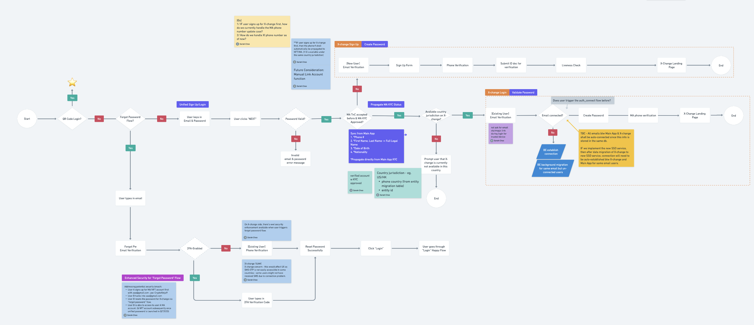
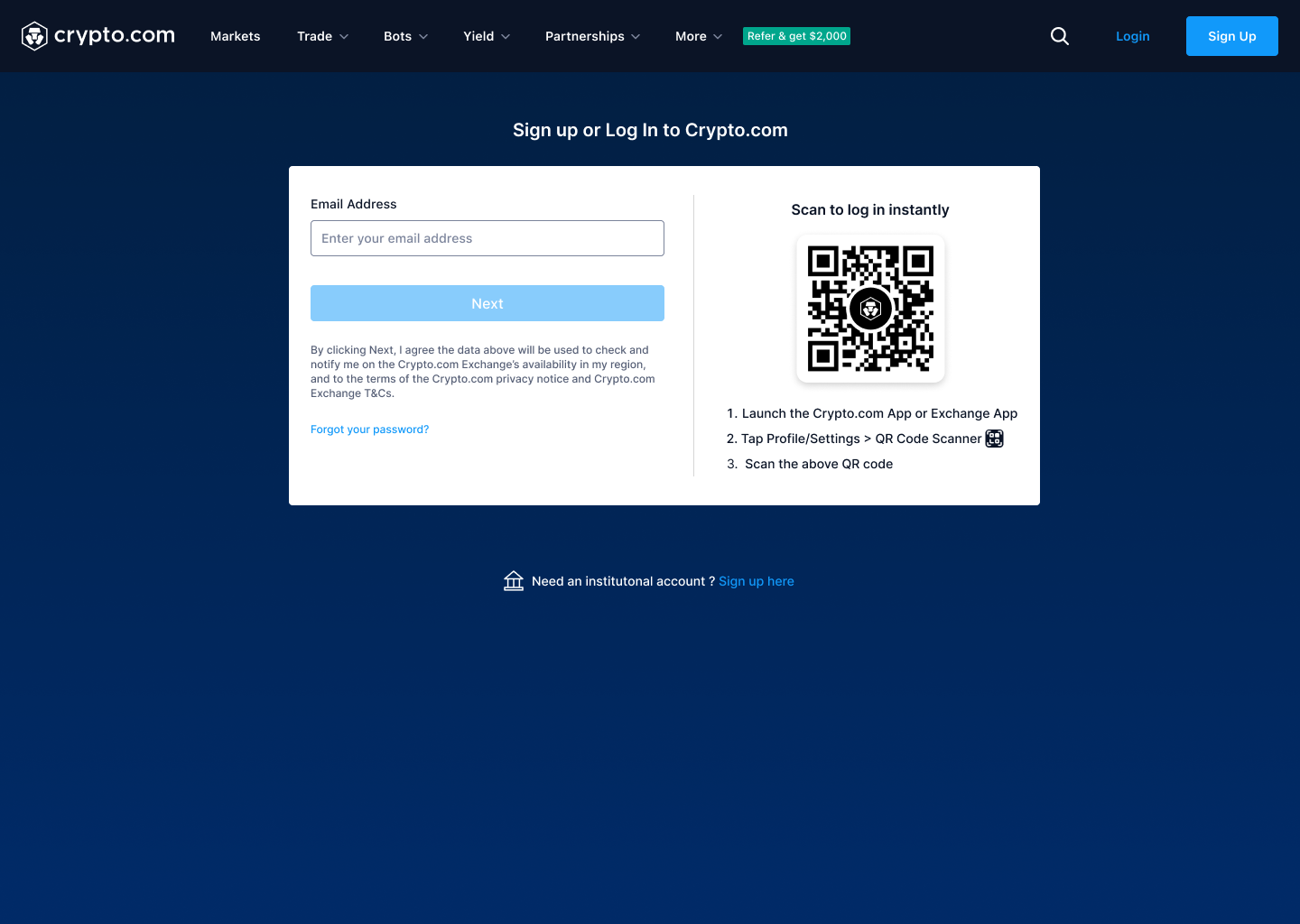
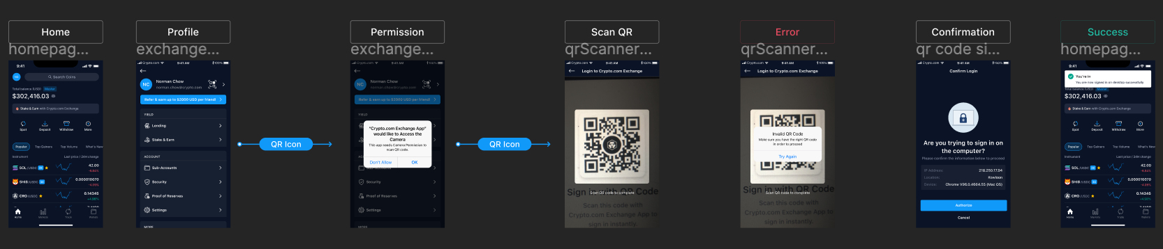
I initiated conversations with the backend developers to understand the underlying processes of how a SSO works. It was more complicated than I had thought it would be so I created a user flow to aid me in visualising how the backend interacted with the frontend, which informed me of what designs were required.
This flow chart that I created turned out to also be helpful to the PM on this project so we ended up collaborating on this which kept all stakeholders involved up to date.

Designing with compliance
One of the initial design options was to have the user first enter their email (left) and if the credentials exist, they would be brought to the next screen (right) where they would enter their password to login.
However, we decided not to continue with this design option due to security and compliance issues. The 'Welcome back!' displayed along with some parts of the users email, would signify to hackers that this user profile exists in the database and allow them to proceed on figuring out their password. As user security is more valuable than the slight benefit in UX, I had to explore other design options.

Solution
After discussions with the back end team we were able to find a more secure solution. We could still give this streamlined login experience where the users email was recognised but with the added benefit of the hidden password field. This solution allowed us to create an extra barrier against hackers while still keeping the same streamlined process in place.

QR Code Login
We wanted users to be able to log into their account by scanning the QR code on either the main Crypto.com app or the Exchange app. Considering this project was intended to be applied to all products across the product ecosystem, it was desirable to maintain consistency in the user flows.
Through my research on other competitors, I noticed that they placed more importance on users being able to find the QR code easily by placing it on the home/landing page. Understanding its value in reducing user friction, I had intended to do the same by placing it on the top right of the home screen.
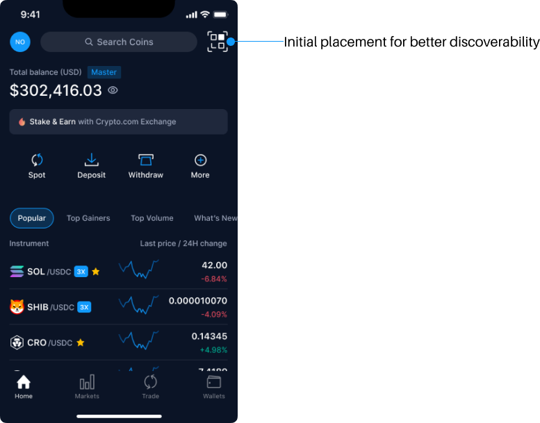
Though with the intent of keeping consistency between products, the Main app team wanted the QR code in the Exchange app under 'Profile'-> 'Settings' which was 3 clicks away from the home page. I had kept a strong conviction of wanting it to be placed on the home screen for easier discoverability for users and referring back to my research on Binance, OKX and other competitors as a point of contention.
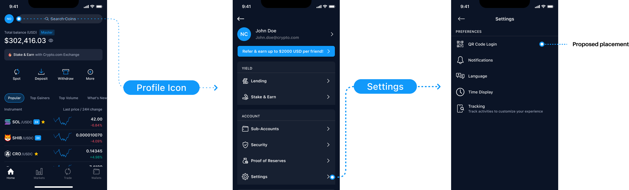
After a series of discussions, we settled on placing the entry point for the QR code scanner under the 'Profile' page located on the top left corner to align with the Crypto.com main app.

A Unified Blocker
Initially setting out to build a unified login/signup experience the UX research team conducted an A/B test on some users. The results of this research suggested that the unified login/signup method was significantly more confusing than the traditional split login/signup, because users were unaware of the page's dual use - finding it difficult to identify that log-in text fields functioned as sign-up text fields too.
As a result of the user feedback, we decided to revert back to the traditional split login/signup and tackle the unified login/signup in future updates.
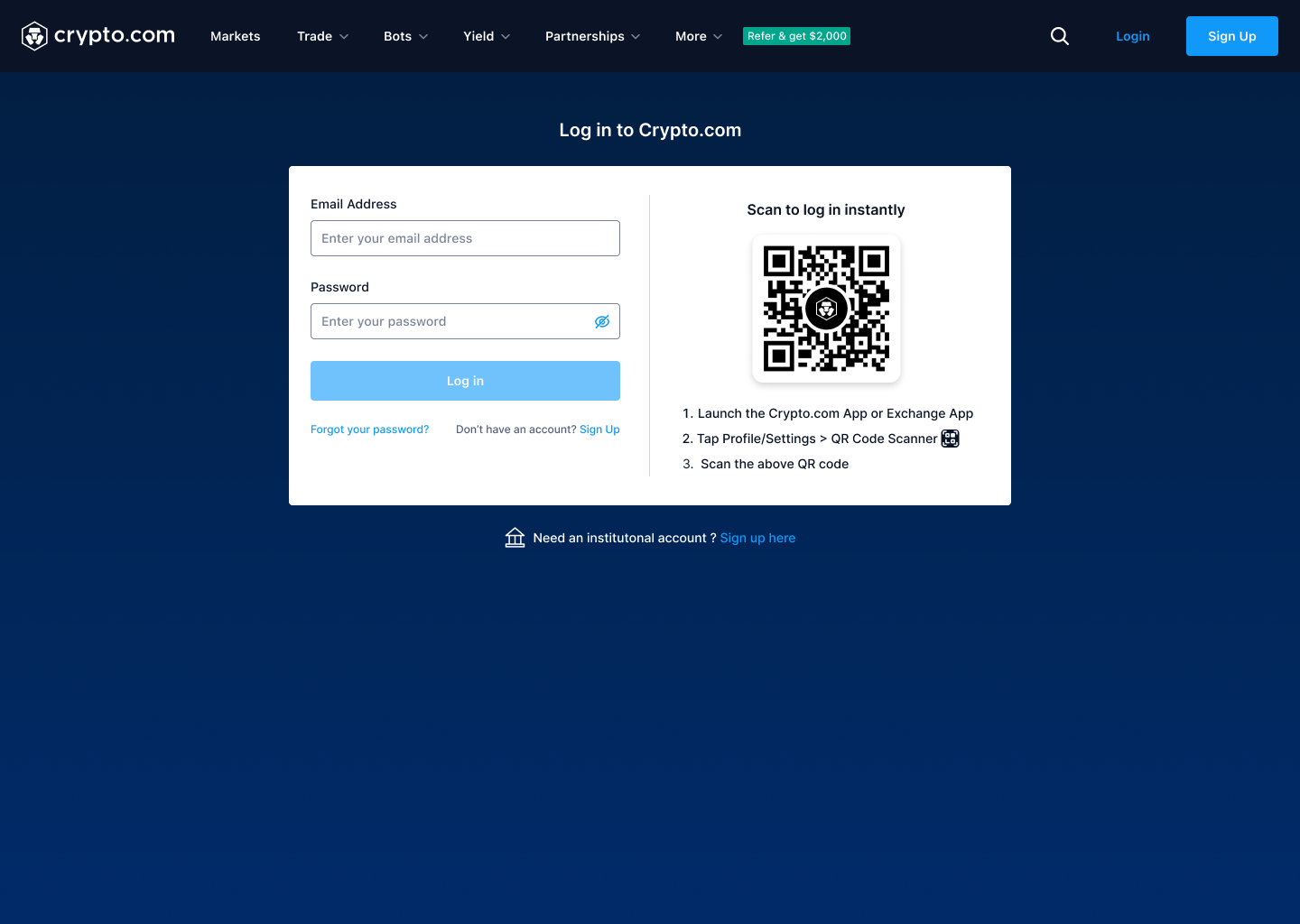
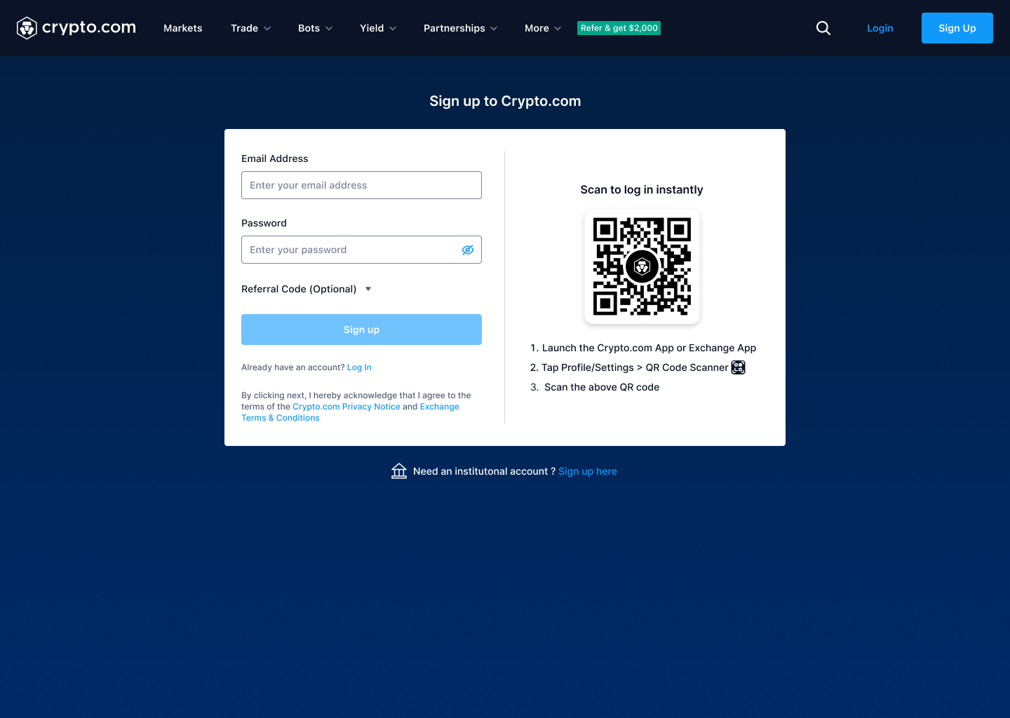
Looking at the sign up screen, the product team felt strongly to keep the QR code in the sign up screen despite not bringing benefits to the new user. This allowed me to realise that sometimes there are constraints to certain situations where designs may need to be compromised. Though in future updates, I would have liked to test the QR code placement on users to see its effectiveness and bring those insights to the product team.